Wolf lets you build beautiful and mobile-friendly websites. Wolf is a Mac app that focuses exclusively on responsive layout design, with support for unlimited number of websites and full offline editing. Once you are done with your design, you can export all design into responsive source code, ready for publishing to any web host using your FTP client.
Features:
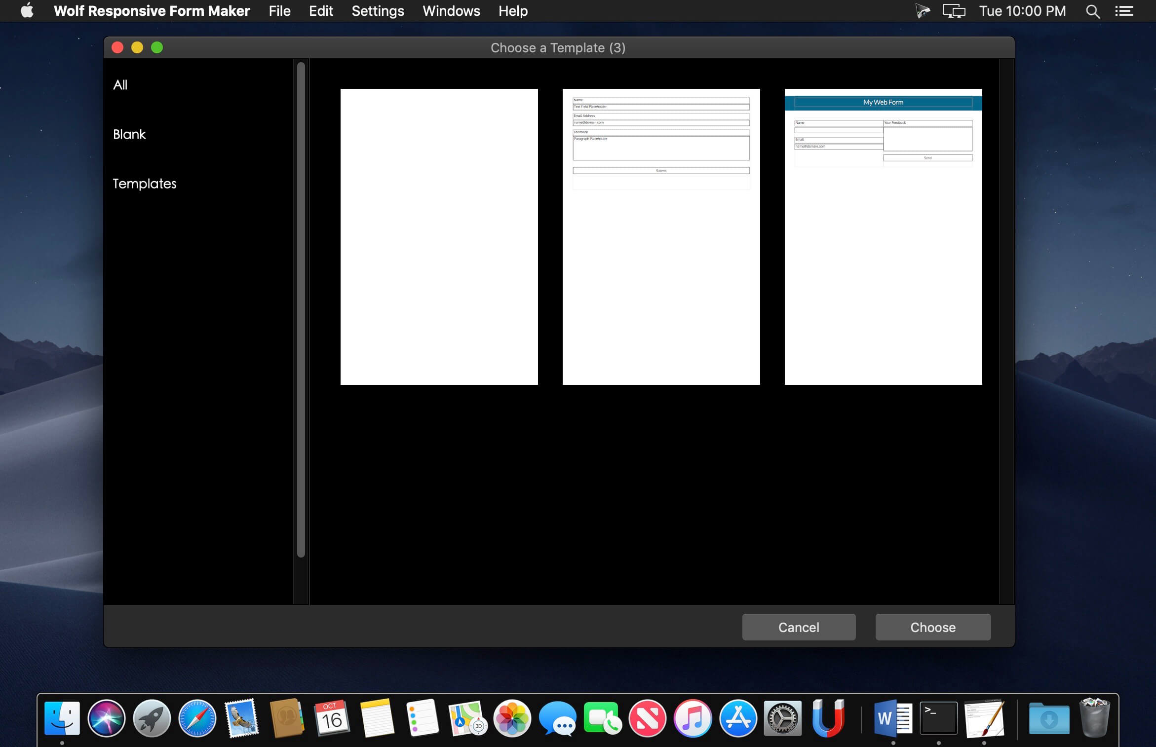
Brought to you by the team behind the Orion Mac Suite, Wolf’s editor interface is designed with key focuses on simplicity and ease-of-use. Drag-and-drop to add objects to your design, click-and-drag to resize and manage layout.
Zero coding: We think web design should be simple and fun, so anyone can build beautiful websites without needing to learn or understand how to code.
Responsive and mobile friendly: Integrated with the powerful Bootstrap framework, your website will look amazing on desktop, tablets, and mobile devices.
Shared website header and footer: Easily build and maintain a consistent theme for the entire website using Wolf’s exclusive Shared Header and Footer feature.
Professional templates: Beautiful templates allows you to get a jump start on your web design.
Standalone software: Unlike many other web design solutions that are based on monthly subscriptions, Wolf is a true standalone app. No subscription fees, just a straightforward, one-time purchase.
Beautiful web fonts: Beautiful web fonts is key to a building a successful website. Wolf provides you with a wide selection of gorgeous web fonts so you can format and style with ease.
Carousel: Add more interactivity to your website with amazing, full-screen width, image, and text carousels.
Galleries: Gorgeous lightbox galleries. Display your photos in a lightbox when they are clicked.
HTML snippets: You’re never limited to the drag-and-drop interface. Easily add code snippets to achieve custom effects and special plug-ins.
Wolf 2 – Responsive Designer Pro 2.30.4 MAS + InApp
responsive layout design, with support for unlimited number of websites and full offline editing. Once you are done with your design, you can export all design into responsive source code, ready for publishing to any web host using your FTP client.
Features: • Brought to you by the team behind the Orion Mac Suite, Wolf’s editor interface is designed with key focuses on simplicity and ease-of-use. Drag-and-drop to add objects to your design, click-and-drag to resize and manage layout. • Zero coding: We think web design should be simple and fun, so anyone can build beautiful websites without needing to learn or understand how to code. • Responsive and mobile friendly: Integrated with the powerful Bootstrap framework, your website will look amazing on desktop, tablets, and mobile devices. • Shared website header and footer: Easily build and maintain a consistent theme for the entire website using Wolf’s exclusive Shared Header and Footer feature. • Professional templates: Beautiful templates allows you to get a jump start on your web design. • Standalone software: Unlike many other web design solutions that are based on monthly subscriptions, Wolf is a true standalone app. No subscription fees, just a straightforward, one-time purchase. • Beautiful web fonts: Beautiful web fonts is key to a building a successful website. Wolf provides you with a wide selection of gorgeous web fonts so you can format and style with ease. • Carousel: Add more interactivity to your website with amazing, full-screen width, image, and text carousels. • Galleries: Gorgeous lightbox galleries. Display your photos in a lightbox when they are clicked. • HTML snippets: You’re never limited to the drag-and-drop interface. Easily add code snippets to achieve custom effects and special plug-ins.
Name: ScreenPlus - Realistic & Responsive Screen Mockups
Created: 6 May 14
Last Update: 6 May 14
High Resolution : Yes
Layered : Yes
Graphics Files Included: Photoshop PSD
Minimum Adobe CS Version: CS5
Pixel Dimensions: 2400x1600


Features

• 11 Unique Mockups
• Ultra Realistic
• Different Perspectives & Sceneries
• Easy Replacement via Smart Objects
• 2400×1600 Pixel
• Different Devices for Responsive Designs
• Perfect for Webdesigns, Themes, UI Design, Wallpapers, Photos, Apps and more

Themes used in the preview

• Eleven by ClaPat
• Apenines by THEMPLE
• Approach by G10v3
• Tour Package by GoodLayers
• Real Homes by InspiryThemes
• Gameplan by cactusthemes
• Deita Theme by entiri
• A4 Sheet: Asian dragonby MarinaAlex


Link for more information: http://graphicriver.net/item/screenplus-realistic-responsive-screen-mockups/7673872


